

Results 31 to 40 of 62
Thread: 2018 car launches
-
22nd February 2018, 23:12 #31Senior Member

- Join Date
- May 2005
- Location
- Philadelphia
- Posts
- 5,943
- Like
- 1,228
- Liked 373 Times in 289 Posts
https://www.auto-motor-und-sport.de/...p-6183803.html
Red Bull up to their old tricks. Manipulating pictures to hid elements of their new car. SMH
It's not as if their car is the leader of the pack that everyone is falling over themselves to copy.you can't argue with results.
-
23rd February 2018, 09:00 #32Senior Member
- Join Date
- Jan 2012
- Posts
- 2,273
- Like
- 3,043
- Liked 467 Times in 284 Posts
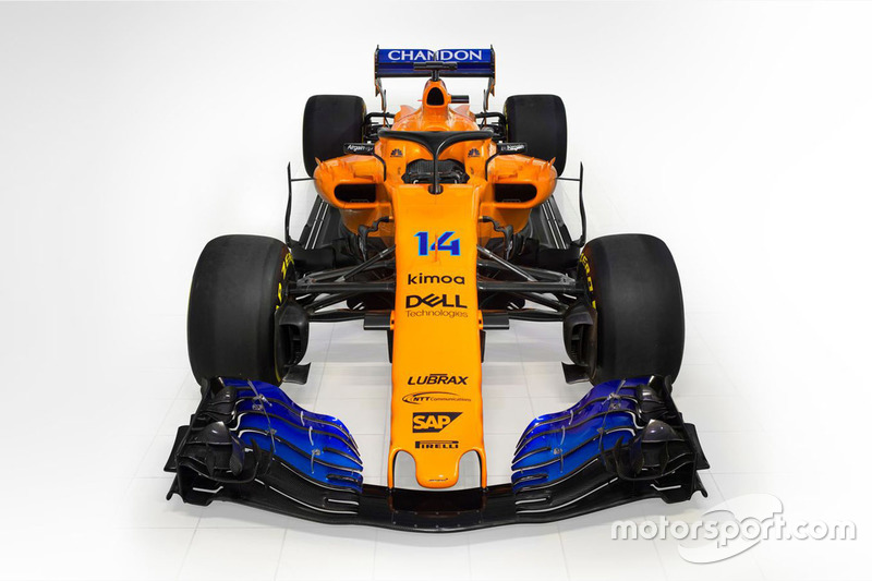
Mclaren with even less sponsors than Sauber

-
23rd February 2018, 09:49 #33Senior Member
- Join Date
- Aug 2010
- Location
- Seville
- Posts
- 1,562
- Like
- 279
- Liked 203 Times in 148 Posts
I was quite hyped about this season's McLaren, but I'm disappointed. I guess the black had to go after Honda left, but this season's livery is a bit of a disappointment to me. Last year's was striking, but this year's is rather lame.
I'm loving this year's Merc, BTW.
-
23rd February 2018, 10:49 #34Senior Member
- Join Date
- Jan 2012
- Posts
- 2,273
- Like
- 3,043
- Liked 467 Times in 284 Posts
It depends a lot on the lightning and post-processing. Will compare them again very soon in Spanish testing.

- Likes: truefan72 (23rd February 2018)
-
23rd February 2018, 12:06 #35Senior Member
- Join Date
- May 2005
- Location
- Philadelphia
- Posts
- 5,943
- Like
- 1,228
- Liked 373 Times in 289 Posts
well the papaya orange looks great in natural light.
Very barren in terms of sponsorship and they have already announced a raft of changes on the car by the time they get to Australia.
So i am a bit mixed about the car so far.you can't argue with results.
-
23rd February 2018, 13:27 #36Senior Member
- Join Date
- Aug 2005
- Posts
- 2,946
- Like
- 173
- Liked 308 Times in 206 Posts

The McLaren looks ok-ish in Orange, I'm sure it will look at lot better by OZ. The lack of sponsors isn't a nice thing to see though.
OT- Without the Honda money, I wonder if Alonso agreed on a pay cut as part of the deal to go with Renault... or is money really not an issue for Mac?
-
23rd February 2018, 14:38 #37Senior Member
- Join Date
- Aug 2010
- Location
- Seville
- Posts
- 1,562
- Like
- 279
- Liked 203 Times in 148 Posts
I am not so sure that the McLaren is lacking sponsors. The livery is completely plain in most places and the sponsors' logos are rather small, so the car looks rather barren. However, when you count how many different logos there are in the car and compare it to Renault, you'll find Macca wins.
I've counted 15 different sponsors on McLaren, whereas in Renault I've only identified 11. So don't be deceived about the apparent emptiness of the McLaren, because it's only that - apparent.
And how many logos are there on the Mercedes? Take away the Mercedes/AMG logos and Petronas' and I'm not sure there's any. (Yeah, they're a manufacturer with very deep pockets, but still.)Last edited by N4D13; 23rd February 2018 at 14:40.
-
23rd February 2018, 17:39 #38Senior Member
- Join Date
- May 2015
- Location
- Greenwich, London UK
- Posts
- 3,442
- Like
- 14
- Liked 790 Times in 652 Posts
My God, they have got it very wrong at Mclaren. All the lighting in the world is not going to help. This is the worst Mclaren livery ever from a team that had a special place of being the style guru for livery. I hope the blue makes the car go faster, but l struggle to warm up to this livery. I like the shade of orange of the main parts of the car. That said the packaging looks very cool and aggressive. The lines of the chassis is one of the best out there. I can see that it may go very well if the Renault engine delivers on it promise to improve this year. Originally Posted by A FONDO

It is interesting to see that they have turned up with a raked chassis this year like the 2017 Redbull and Ferrari. But it seems to have a longer wheelbase which may be taking cues from the Mercedes. It also seems to wrap round the engine tightly, one of the striking aspects of the Mercedes W09 as well. Livery aside, l would be anxious to see this car go in anger at Barcelona.Last edited by Nitrodaze; 23rd February 2018 at 20:09.
Better a witty fool than a foolish wit.
William Shakespeare
-
23rd February 2018, 20:43 #39Senior Member
- Join Date
- May 2015
- Location
- Greenwich, London UK
- Posts
- 3,442
- Like
- 14
- Liked 790 Times in 652 Posts
Actually, l asked my self after l wrote my last post, what did not like about the Mclaren livery? Why did l not like it?
The answer that came to mind was Orange and deep Blue do not seem a harmonious combination. The Orange Mclaren liveries of past years worked well because they were either only orange or a combination or Orange and black which complimented each other very well. The deep blue contrasts the orange like a compromise of two tangential philosophies. The blue just do not have the depth of black . Maybe a lighter metallic blue would have had a better impact. But to be honest, l don't care much about the livery, what l care about is whether this car is fast enough to get Mclaren back into the sharp end of the grid.
If it is doing duel with Redbull, Ferrari and occsionally Mercedes, they can paint the car mauve or purple whatever, l would be happy. I also have a feeling that l might come to like it after a few races into the season. But my first impression was one of pure horror.Last edited by Nitrodaze; 23rd February 2018 at 20:50.
Better a witty fool than a foolish wit.
William Shakespeare
-
23rd February 2018, 21:44 #40Senior Member
- Join Date
- Jan 2012
- Posts
- 2,273
- Like
- 3,043
- Liked 467 Times in 284 Posts
Agree with you mate, total disparity of these two colors. It actually looks like they found that deep blue left behind in grandma's closet and got it for free.
About the other guy - smaller text size sponsors pay much less money you know.


 Reply With Quote


Chinese Grand Prix: More competitive race for Williams. The 2024 Chinese GP would see the Williams Racing Team again come away with another failure to score points but this race would see a more...
2024 Formula 1 Preview &...