

Results 1 to 10 of 21
-
19th January 2013, 01:27 #1Senior Member

- Join Date
- Dec 2006
- Location
- South East England
- Posts
- 1,490
- Like
- 232
- Liked 169 Times in 131 Posts


Formula 1 Season with best car liveries
Ok this thread is to nominate seasons which seasons have been the best for car liveries.
Whatever the year, there are always some stunning cars on the track, but the absolute number one by a mile for me is 2000.
That had everything. I thought EVERY car looked absolutely beautiful.
The McLaren, further refined, quicker and more reliable than before, was stunning as usual.
Ferrari took on a more modern look for their improved machine with white front wings replacing black. I actually REALLY liked the new look. It looked fresh and suited the new millenium and the arrival of the very promising Barrichello.
Jordan made their livery more vibrant and flourescent which looked so much better than their good, but more drab '99 design.
The first Jaguar - nuff said.
I liked the Williams BMW, especially the early season design which had more white. It was clean and no-nonsense and I think really suited the start of a new era with BMW, and Jenson.
The Benetton's whole sky blue appealed to me, as they went back to basics and enjoyed a slightly improved season. It was only when it was retained for 2001 that it became less fun for me.
The Prost somehow seemed to have a much more vibrant blue which I found mouthwatering, espeically with the Yahoo! sponsorship and the arrival of Jean Alesi! Shame about their season.
The 2000 Sauber looked even more gorgeous than usual - especially with Salo and Diniz's helmets. That car, with it's 785bhp Ferrari engine and closer Ferrari technical support looked really strong in the first few races!
As for the next car, when I was up at 3am watching the ITV build up, they did a preview of the teams one by one. When they got to Arrows and I saw their livery for the first time, I exclaimed out loud "WOW!!" and I think my heartbeat increased significantly. I still say even now, that that is one of my best ever F1 moments. Quite simply, I'd say this is my all time favourite livery of any F1 car, ever. And that machine looked FAST! It was a revelation, and hugely fast in a straight line. They amazed me by qualifying 12th and 13th! Even better in the race when among strong cars they ran 9th and 10th. Judging by how the race went, perhaps they could have both finished 5th and 6th. The Orange Arrows often challenged for the points, and several times more than that! How sad that they would close down just 2 years later...
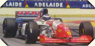
Now, I never knew there used to be a magazine called 'F1 News' until my mum got me a copy in February 2000. I always got F1 Racing back then. But flicking through that mag with their interesting 2000 season preview (and equally interesting 10 year earlier - 1990 - flashback) I copped my first look of the Telefonica Minardi. I was horrified as it was the most disgusting F1 car I'd ever seen. It was even more disappointing than Max Wilson losing out on a drive in favour of Gaston Mazzacane. But how things change. When I saw how quick the car was, considering the 745bhp Ford lump when the works car had around 810bhp I think, and actually watched it on TV, it really started to grow on me. So much so in fact, that it became one of my all time favourites! I think it WAS the fact that the chassis was so nimble and fast that helped though - especially given that I hear Adrian Newey used to mosey down to the other end of the pitlane to see if he could get any ideas from them!!
I actually quite liked BARs unique 1999 design, but that was far surpassed by their white - with silver(!) 2000 version. It looked so much better, it looked professional, and was very fitting for a much improved season with a strong Honda engine! It sounds boring but it's one of my favourites!
So basically every single one of those cars were gorgeous I think. Not even one disappointed me. I loved them all so much that for my Art GCSE in 2000, I drew a large picture in pencil of the 22 cars at the start of a race coming towards turn 1! I couldn't capture all the great colours though. I started one with colour pencils but it just wasn't working. It looked far better in greyscale. I'm very fond of it, and think they still have it at school somewhere.SPAM - Going off topic to give you the deals you don't want.
-
19th January 2013, 08:51 #2Senior Member
- Join Date
- Jun 2009
- Location
- Chelmsford, Essex, United Kingdom
- Posts
- 10,568
- Like
- 695
- Liked 653 Times in 512 Posts
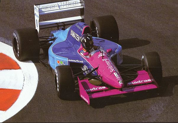
I think I may agree, 2000 was good as was 2001. I especially liked the 2001 Prost, such a sparkling blue.

Although Minardi weren't as spectacular.
There have been some great individual designs even if the season wasn't the best.
1995

One of the worst maybe. :
:
 I still exist and still find the forum occasionally. Busy busy
-
19th January 2013, 09:01 #3Senior Member
- Join Date
- Jun 2009
- Location
- Chelmsford, Essex, United Kingdom
- Posts
- 10,568
- Like
- 695
- Liked 653 Times in 512 Posts
1995 Pacific was interesting when it actually Qualified.

I always had a thing for bizzare liveries. 1993 Lola

I liked the 1998 Arrows.
 I still exist and still find the forum occasionally. Busy busy
-
19th January 2013, 09:04 #4Senior Member
- Join Date
- Jun 2009
- Location
- Chelmsford, Essex, United Kingdom
- Posts
- 10,568
- Like
- 695
- Liked 653 Times in 512 Posts
However that 2000 Orange Arrows was a beut. So sharpe and fresh.
 I still exist and still find the forum occasionally. Busy busy
-
19th January 2013, 17:21 #5Senior Member
- Join Date
- Dec 2006
- Location
- South East England
- Posts
- 1,490
- Like
- 232
- Liked 169 Times in 131 Posts
They're all SO juicy!
I'm actually really fond of that '95 Arrows, I prefer it to the 1994 version as it seems to have more red. However, I think the '96 Arrows (all red with blue, not the early season one with lots of white) was amazing.
For some reason I've always really liked that 2001 Prost. Something about the fact it was quite understated and plain seemed to make it really good for me, but most of all I like the slightly lighter shade of blue for some reason. And I've always liked the '94 Pacific because of GP2 - the silver was very cool.
If I try to list the ones I like I'll just list them all! The only one team that never seemed to have as good a livery as they could have was Larrousse. I was never fond of the yellow, red, blue and green mess and wonder how they manage to makethem so unappealing when Benetton did an amazing job with those same colours.SPAM - Going off topic to give you the deals you don't want.
-
20th January 2013, 19:12 #6Senior Member
- Join Date
- Sep 2005
- Location
- Tonbridge, Kent
- Posts
- 101
- Like
- 0
- Liked 1 Time in 1 Post
1994 was one of my favourites, partly because there were so many livery changes from the previous season. In particular, the Rothmans Williams and Mild Seven Benetton stood out from the crowd.
-
21st January 2013, 00:01 #7Senior Member
- Join Date
- Mar 2001
- Location
- Sep 1666
- Posts
- 10,462
- Like
- 15
- Liked 201 Times in 155 Posts
1986
McLaren - red and white Marlboro
Lotus - black JPS
Ferrari - still with a proper scarlett
Williams - with their Canon/ICI kit
Brabham - had their blue and white Olivetti
Benetton - with their wild United Colours paint splash
Zakspeed - red and white West colours
Minardi - black and yellow
The identity of most teams was stronger when they didn't play with confusing swirly swishy schemes. A livery in order to stay "on message" at 300km/h needs to be simple.The Old Republic was a stupidly run organisation which deserved to be taken over. All Hail Palpatine!
-
21st January 2013, 03:55 #8Senior Member
- Join Date
- Mar 2002
- Location
- Texas
- Posts
- 2,462
- Like
- 0
- Liked 0 Times in 0 Posts
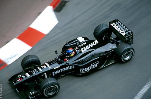
Oooooh, the 2001 Prost car, I had forgotten about PSN completely, an Argentinian channel, Passion Sports Network, "Pasión por el Deporte".
They had the rights for F1 and the Copa Libertadores (South America's equivalent of the UEFA Champion's League) for much of the American Continent.
They had their logo not only on the Prost's livery, but on many football teams in almost every league in the Americas, funny thing is that they are completely forgotten now, you can't even find info on the internet, which is why I had forgotten completely about them.Jose Arrambide
Nobody Expects The Spanish Inquisition
Monty Python Flying Circus
-
21st January 2013, 11:49 #9Senior Member
- Join Date
- Dec 2004
- Location
- South Shields, United Kingdom
- Posts
- 1,671
- Like
- 0
- Liked 3 Times in 3 Posts
I've always had a soft spot for Minardi's 1996 colours of Black and White with Green wings, it always stood out very well

But my all time favourite is that Orange Arrows from 2000
 "Alboreto, into the pits, and im going to stop the startwatch" (Murray Walker, Monaco 1987)
-
21st January 2013, 13:25 #10Senior Member
- Join Date
- Jun 2009
- Location
- Chelmsford, Essex, United Kingdom
- Posts
- 10,568
- Like
- 695
- Liked 653 Times in 512 Posts
1997 Minardi was Ok, trying a return to something including their traditional yellow & black.
 I still exist and still find the forum occasionally. Busy busy

 Reply With Quote


What?
What's the first thing to come to...